This demo has several versions:
This demo is a recreation of the infamous Cover Flow UI, once featured by Apple Inc. in iTunes for visually flipping through album artwork.
Each album cover has a View Timeline attached, driving an animation to rotate the cover sideways when offscreen and have it facing forwards when at the center of the scroller.
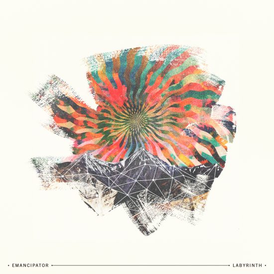
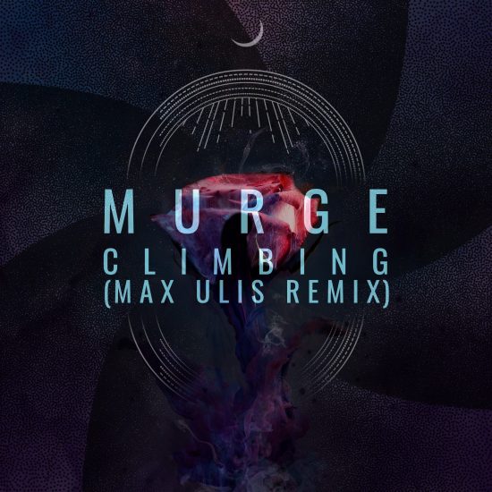
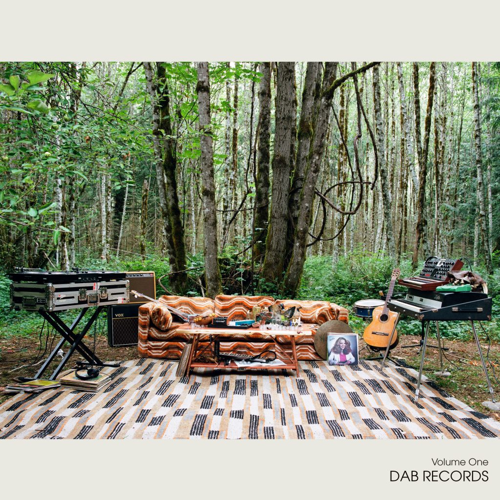
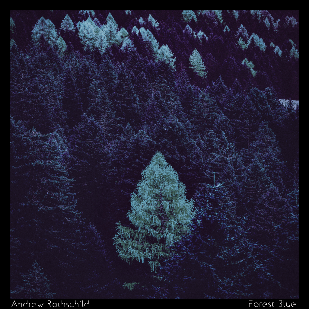
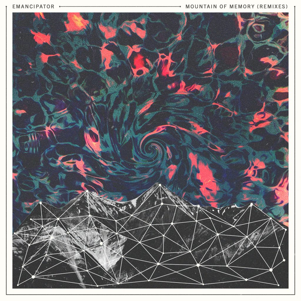
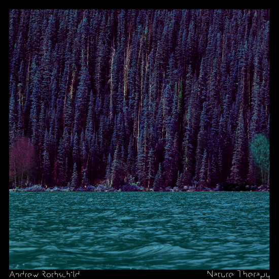
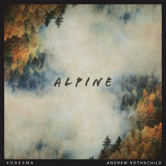
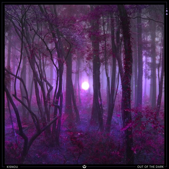
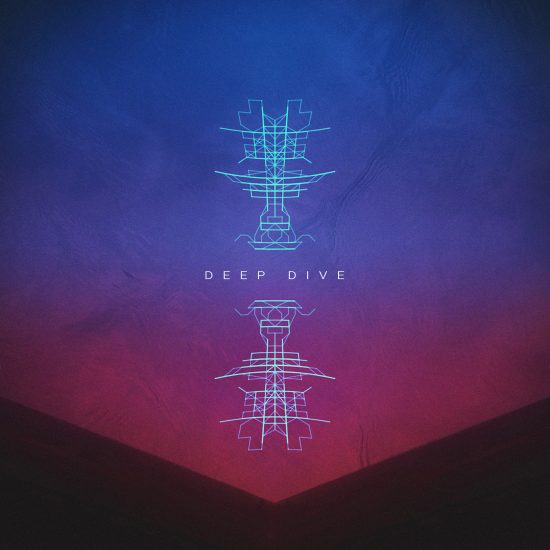
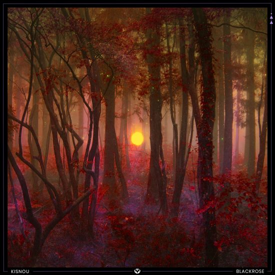
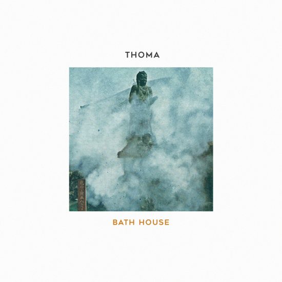
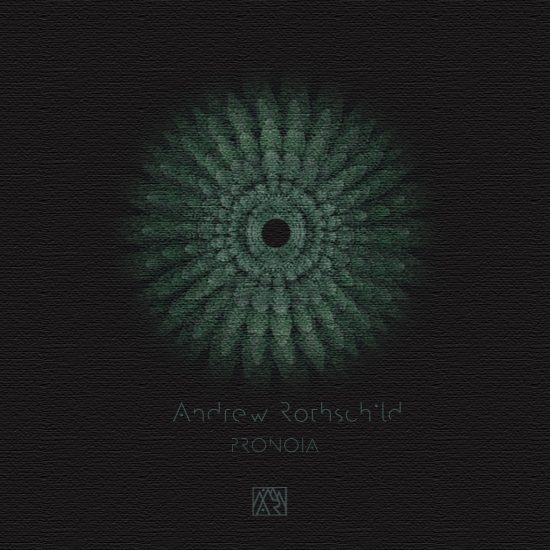
The album covers are from albums all released on the wonderful Loci Records record label.
The list of covers is presented in an unordered list, with each list item containing an image of the cover.
<ul class="cards">
	<li>
		<img src="https://example.org/cover1.jpg"
				width="600" height="600" alt="…" />
	</li>
	<li>
		<img src="https://example.org/cover2.jpg"
				width="600" height="600" alt="…" />
	</li>
	…
	<li>
		<img src="https://example.org/cover3.jpg"
				width="600" height="600" alt="…" />
	</li>
</ul>
Using CSS, the albums are on one line and the container is made scrollable
.cards {
	list-style: none;
	white-space: nowrap;
	…
	max-width: calc(var(--cover-size) * 6);
	overflow: scroll;
}

.cards li {
	display: inline-block;
	width: var(--cover-size);
	aspect-ratio: 1;
}
To always have one album cover centered, CSS Scroll Snapping is used.
.cards {
	scroll-snap-type: x mandatory;
}

.cards li {
	scroll-snap-align: center;
}
The album reflections are also done using CSS.
.cards li img {
	width: 100%;
	height: auto;

	-webkit-box-reflect: below 0.5em linear-gradient(rgb(0 0 0 / 0), rgb(0 0 0 / 0.25));
}
There are two scroll-driven animations on each list item, to power the effect
li
z-index
img
The main driver for both animations is a View Timeline on each list item, tracking it for the entirety of the cover range. That way, elements are tracked from entry (0%) to exit (100%). The 50% mark indicates when the element is at the center of its scroller.
cover
.cards li {
	/* Track this element as it intersects the scrollport */
	view-timeline-name: --li-in-and-out-of-view;
	view-timeline-axis: inline;
}
The keyframes for the li elements make it so that at halfway in the scroller, that cover is topmost.
@keyframes adjust-z-index {
	0% {
		z-index: 1;
	}
	50% {
		z-index: 100; /* When at the center, be on top */
	}
	100% {
		z-index: 1;
	}
}
The keyframes for the img work in similar fashion. At the 50% mark, the cover faces forwards. On the other sides, it is rotated sideways.
@keyframes rotate-cover {
	0% {
		transform: translateX(-100%) rotateY(-45deg);
	}
	35% {
		transform: translateX(0) rotateY(-45deg);
	}
	50% {
		transform: rotateY(0deg) translateZ(1em) scale(1.5);
	}
	65% {
		transform: translateX(0) rotateY(45deg);
	}
	100% {
		transform: translateX(100%) rotateY(45deg);
	}
}
Linking everything up, the CSS is this:
.cards li {
	/* Link an animation to the established view-timeline and have it run during the contain phase */
	animation: linear adjust-z-index both;
	animation-timeline: --li-in-and-out-of-view;

	/* Make the 3D stuff work… */
	perspective: 40em;
}

.cards li > img {
	/* Link an animation to the established view-timeline (of the parent li) and have it run during the contain phase */
	animation: linear rotate-cover both;
	animation-timeline: --li-in-and-out-of-view;
}
Because no animation-range is set, the cover range is used.
animation-range
⚠️ Note that key here is that the transforms happen on the imgs, not the lis. If the li elements were transformed, the total scroll distance of the scroller would be affected, causing a flickering effect. By rotating the imgs inside the lis, the size of the li elements – and thus the total scroll distance – remain unchanged.
⚠️ Your browser does not support Scroll-Linked Animations. To cater for this, a polyfill has been loaded.


